US Population New Change
In June 2023, the Census Bureau released new population data. I used Svelte.js to create this visualization. The data granularity extends to the county level. After processing the entire dataset in R, I selected the top 100 counties based on population to compare the changes from 2020 to 2022, hoping to discern post-pandemic migration trends across different parts of the United States.
## How I Made This Visualization
Exploring visualization options. The states are divided into four main regions according to the 1950 Census Bureau standards: Northeast, South, Midwest, and West, represented in the visualization by blue, pink, yellow, and grey respectively.
Each bubble represents a county. You can arrange the bubbles by state location. Click anywhere on the chart to interact. To enhance user interaction, the chart is responsive, includes hover interactions, and features meaningful peripheral elements.
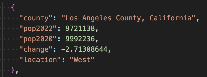
My data.js looks like this:
population change
Using D3-force for Svelte Visualizations
Before using D3-force, I generally apply fixed x and y positions to each circle. D3-force, like a physics engine, determines the position of each circle. I was inspired by Ben Tanen’s tutorial on ObservableHQ.
For this chart, I wanted three forces: forceX, forceY, and forceCollide. I mapped the population change percentage column to the forceX when grouped by region and the forceY force. ForceCollide ensures no two circles overlap.
Drawing Circles
I use SVG to draw circles. One important aspect is to use an {#each} block to iterate over our data. We also use the “g” element to wrap our inner chart, allowing us to add axes later and position them correctly.
Making Circles Reactive and Responsive
I’m actually very confused about using the .on('tick') function. My bubbles always don’t fit in the window. The issue here is that the simulation is re-instantiated every time any of its constituent elements change. Because we are using $: to instantiate the simulation, we essentially overwrite the previous simulation with a new one every time we resize the window.
Connecting Data with Circles
So far, I’ve connected each circle's y-position to its location and its x-position to its population change percentage. In this step, I connected the circle’s color to its grouping variable, which is location, and also connected the radius to its change percentage variable.
Adding Legend and Tooltip
This step is more routine, designed to make the visualization more interactive. It only requires adding hover listeners.
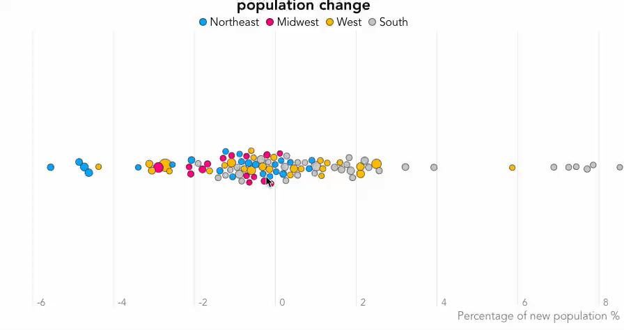
population change