
1214 Ent. Mobile App
Creating an organic music-sharing ecosystem to discover and connect talented music artists.
Project Type
| Aspect | Details |
|---|---|
| Client | 1214 Entertainment |
| Industry | Music Industry |
| My role | User Interview, Wireframing, Storyboard, Prototyping, User Testing |
| Duration | 3 Months |
Initial Concept
Music Artists Cannot Find Like-Minded People
Austin is the Live Music Capital. Many music enthusiasts come here for the melody vibes. However, for niche music starters, they are facing challenges while looking for bandmates, sharing their work, and networking with people who have similar music tastes. We were wondering if events, festivals, and social media help music artists connection or make it worse. Therefore, we decided to look into the problems and find a solution for filling potential connection gaps.
Initial Strategy
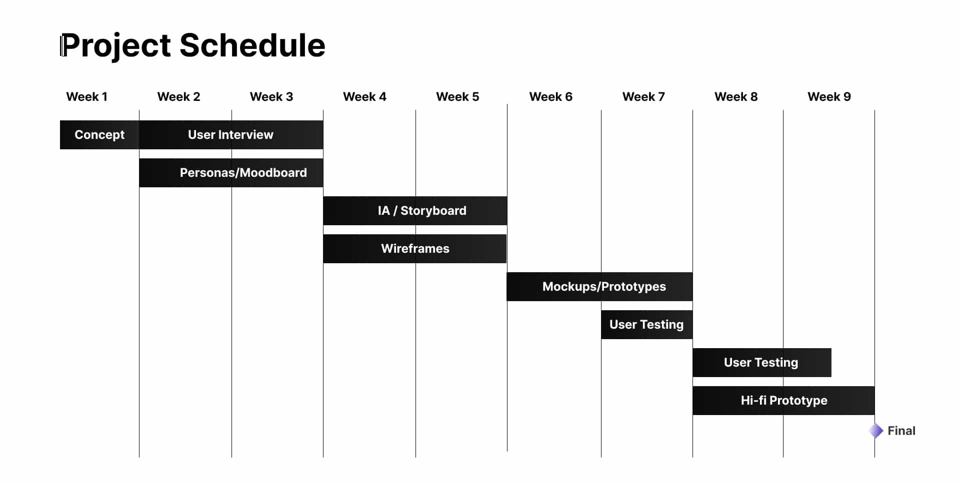
Transforming Artists’ Journeys into Sharing Ecosystem
Our plan was to conduct user research to develop a mobile app for exchanging ideas and pairing up with like-minded artists, producers, and more people. The overall schedule covered over 9 weeks from ideation, research to design.
Research
User Interviews to Delve into Real Problems
To start with, we needed to understand the real problems without bias and assumption, where user interviews took the role. In user interview, our team focused on collaboration, appreciation and showcase experience from music artists and I wrote up the moderator script as a baseline during interviews and moderated through zoom.
The five participants had different level of music experience, including:
- 2 * Novice
- 2* 3-5+ years of experience
- 1* 10+ years of experience
The diverse experience helped our research to cover different challenges music artists would face with and map out the common issues occurred during their music creation journeys.
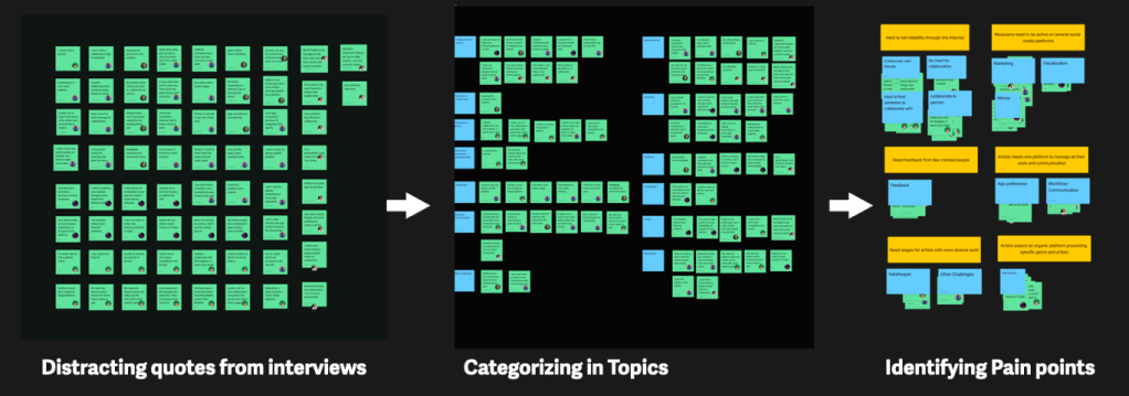
Categorizing Feedback through Affinity Diagrams
After interviewing, we conducted the brainstorming sessions to distract quotes from interviews and identify pain points into affinity diagrams.
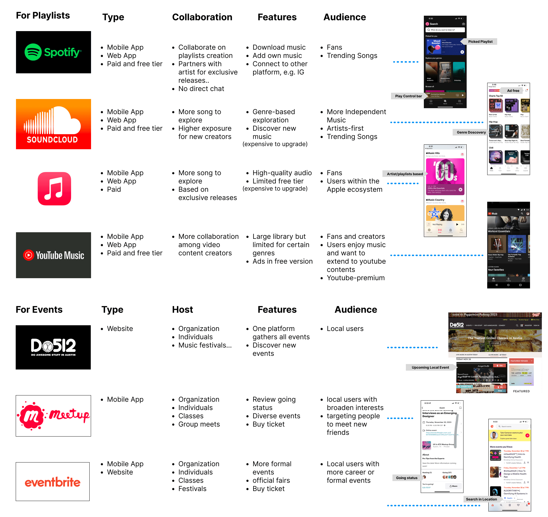
Comparable Analysis
Meanwhile, our tram conducted comparable analysis to learn and find potential opportunities and value propositions among existing apps. In this session, the focus areas are playlists and events.
Insights to Design
Five Pain Points from User Interviews
From generative research, we were able to build 2 personas to identify the primary pain points. The main challenges for music artists were:
- Hard to tell reliability online
- Exhausted about being active on multiple platforms
- Unable to find feedback from like-minded people
- Scrambled in communicating and managing all work
- Breaking walls from gatekeepers for performing diverse music
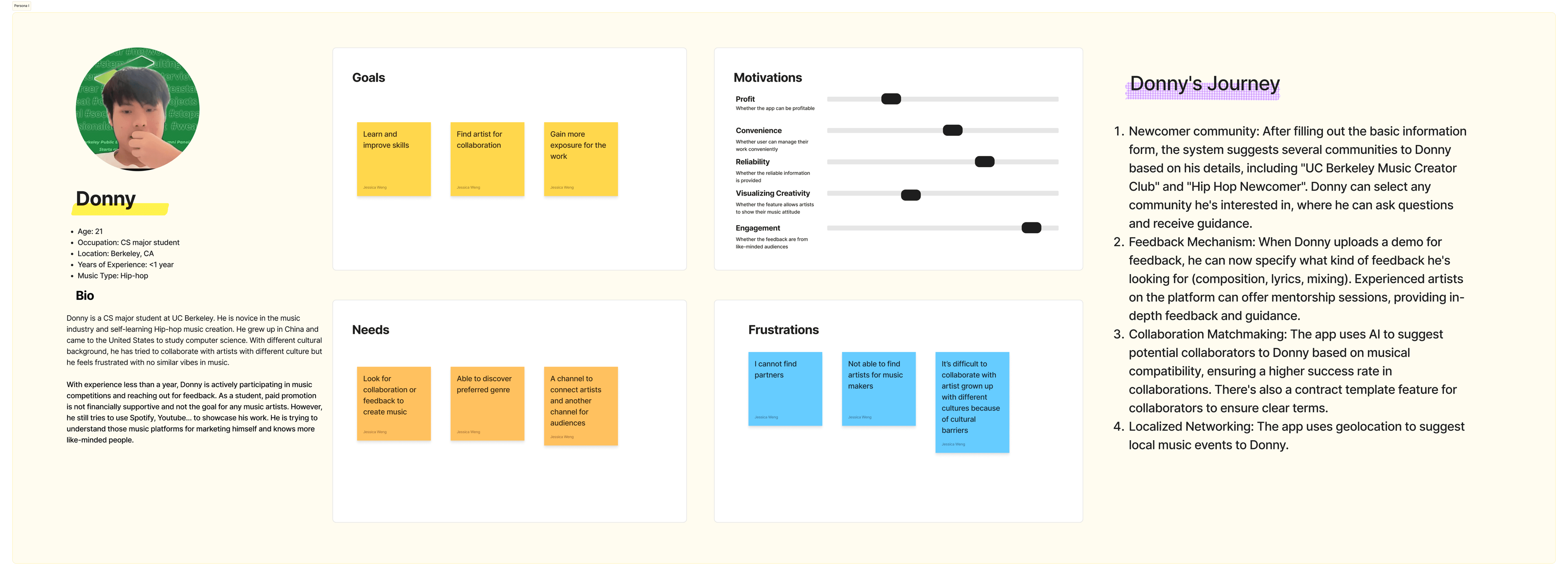
Persona 1:
Donny is a novice music maker who needs channels to connect with like-minded people because he wants to learn and improve his music.
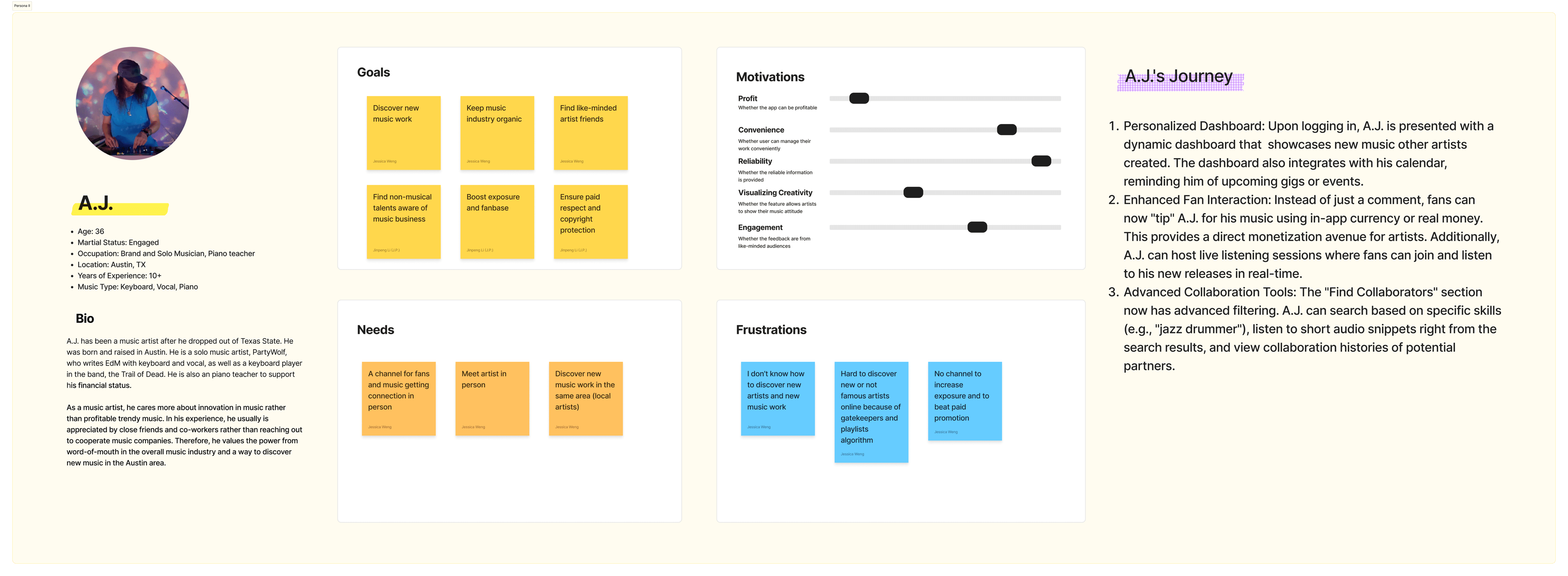
Persona 2:
A.J. is a professional music artist who needs word of mouth to discover local new music because he wants music innovation with reliable artists.
So…we asked ourselves…
How Might We
Create an Organic Music Platform for Artists to Break the Edge and Work with Other Innovation Ones
It’s the time to figure out the solutions. We first settled down with a few visual elements as design principles and central ideas to align with our insights when moving to paper wireframes.
Design Principles as the Baseline Solution
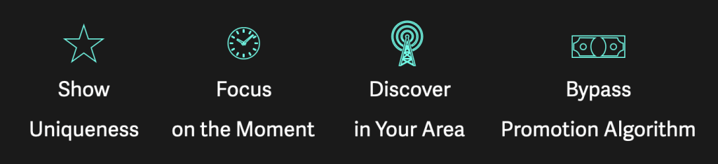
Therefore, the principles were created as our baselines, guiding us to develop solutions to pain points.
- Show Uniqueness: To include diverse creativity, the app shall show artists’ music attitude;
- Focus on the Moment: The app shall have an inclusive environment to encourage instant discovery. It’s for artists to get inspiration and encourage their connection but not for playlists like Spotify.
- Discover in Your Area: The app shall allow users to discover in their areas. Because generally artists are looking for real bonding. Artists prefer to know someone in-person because of trust and realiability.
- Bypass Promotion Algorithm: The app shall show all the work from any artists. The ecosystem is more organic to prevent from paid promotion and trendy music taking over the market.
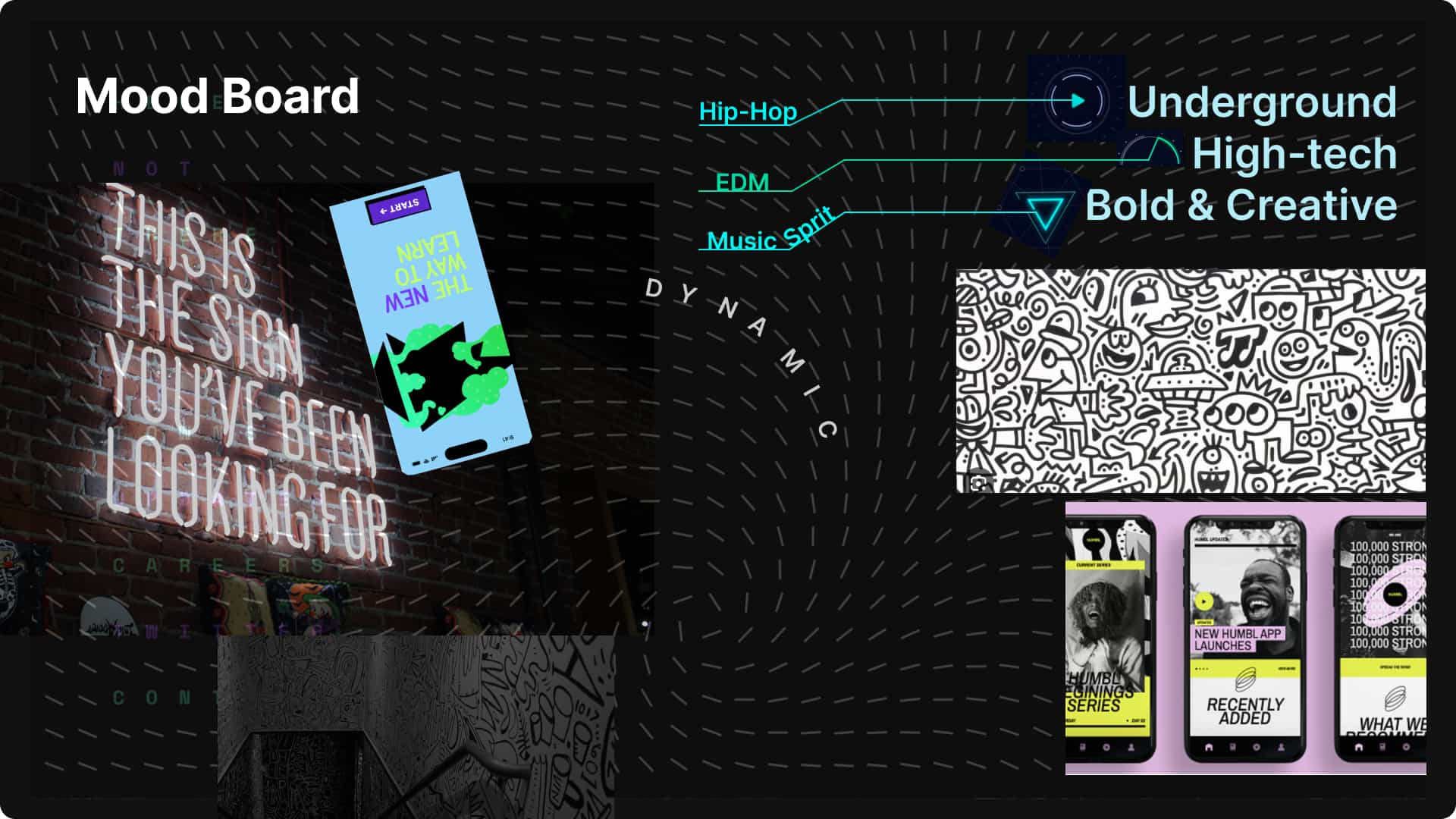
And Moodboard to Sync Our Ideas
Design and Wireframing
Storyboarding Scenarios to Initiate Wireframes
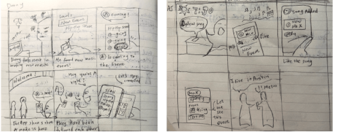
Based on two personas, we brainstormed on stories.
Our primary scenario was generated, matching the best for design principles. The story was about the new artist, Donny:
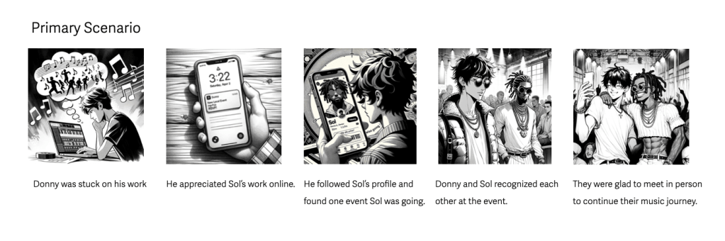
Donny was stuck on his music creation and wanted to reach out for feedback and potential collaboration. However, he had hard time to find artists who like his work and are willing to connect. One day, he found this demo on this app. The artist called Sol, living in the same town. He followed him on the app and saw that Sol was going to an music event next week. Luckily, Donny and Sol recognized each other at that event. With the app profiles, they knew their work and got to chat for their music. Therefore, they were able to continue their music journey as friends and artists.
Sketing 3 Primary Flows
The storylines helped me come up with three essential features: How to explore music work, how to share music work and how to find music events.
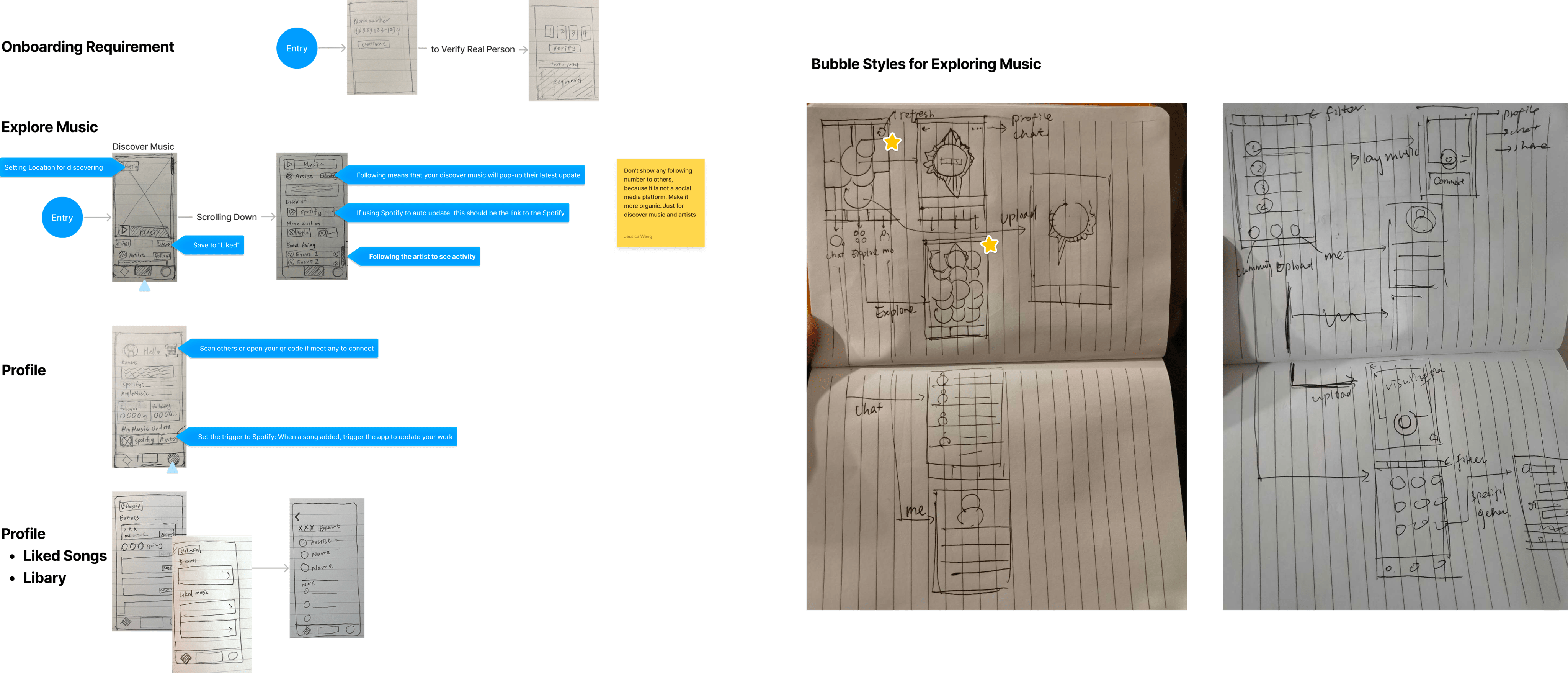
Paper Wireframing to Initiating Information Architecture
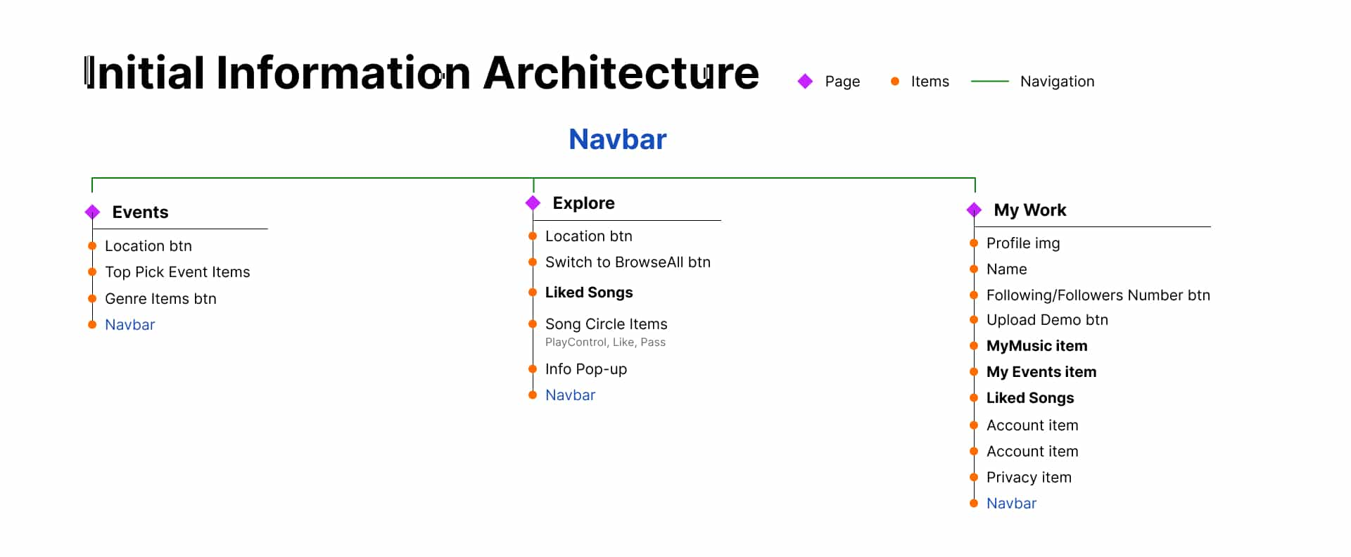
After our discussion, our initial information architecture constructed three essential categories on navbar and corresponding flows.
Prototyping and Testing
Three Sets of User Testing with Different Fidelity Levels of Prototypes
Our team iterated 3+ rounds of prototyping from wireframes, low-fidelity, mid-fidelity to high-fidelity. Based on what we got, we conducted to three rounds of user testing to ensure our design match user needs and expectations.
Prototype 01: Wireframe to Low-fi
- 5 participants
- Moderated test, in-person
Prototype 02: Low-fi to Mid-fi
- 10 participants
- 5* Moderated test+ 5* Unmoderated UserTesting
Prototype 03: Mid-fi to Hi-fi
- 8 participants
- 4* Moderated test, 4* Unmoderated UserTesting
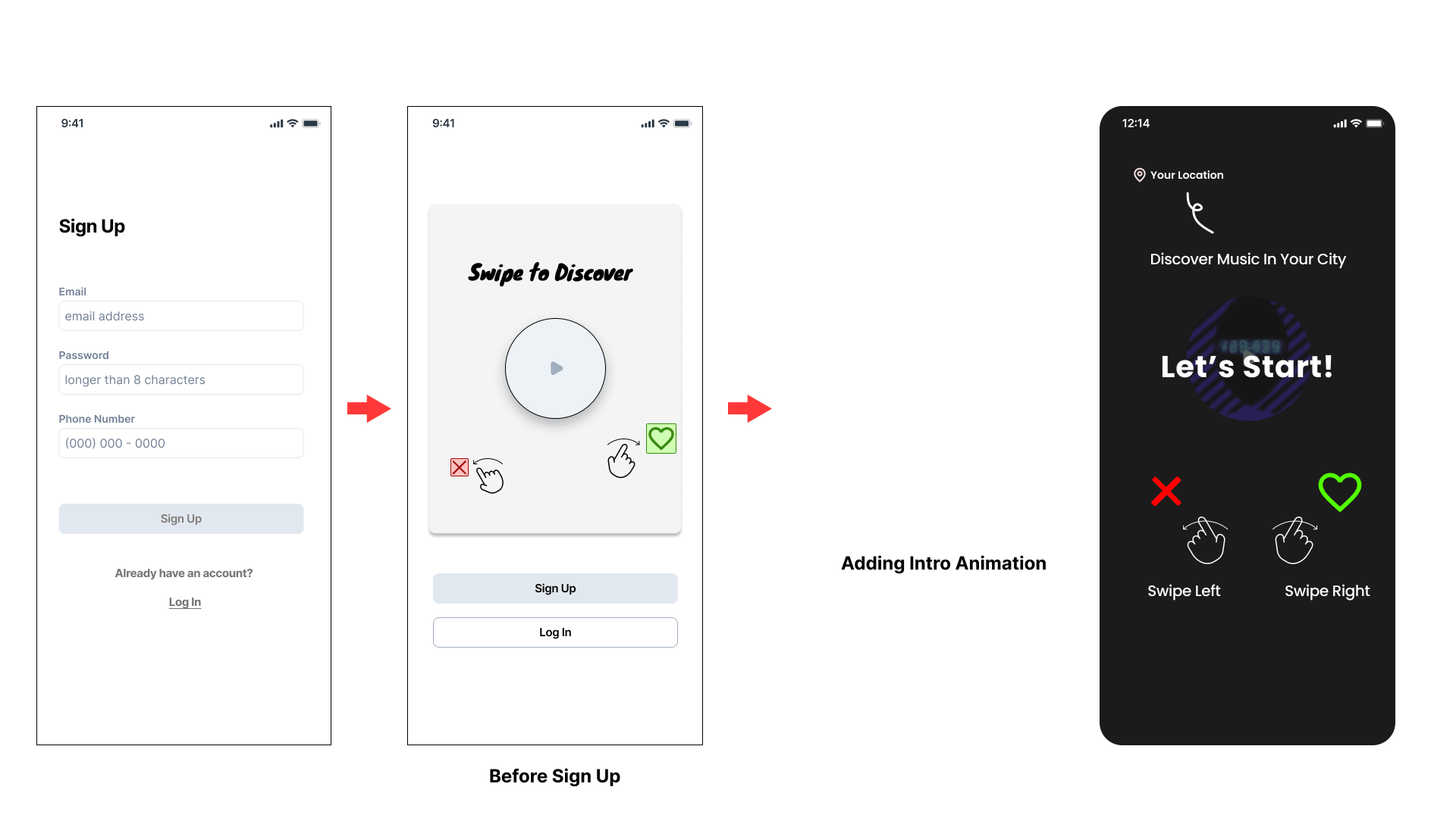
Improvement #1 Adding Introduction for Onboarding
“Not sure what to do when I first landed on the explore page. But after I know I need to either swipe or click, it looks good to me. “
Feedback from user testing
The onboarding experience changed three time for a better instruction for main location and swiping feature.
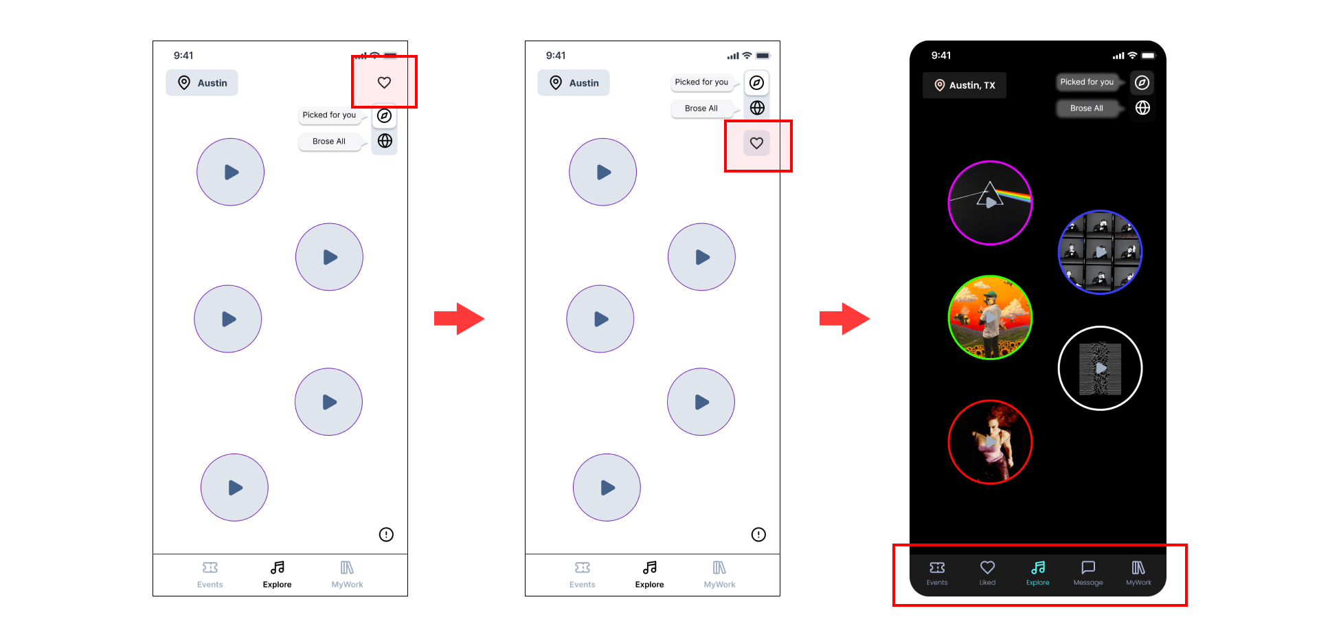
Improvement #2 Changing 3 to 5 Items on Navbar – Moving ‘Liked’ First
“I could find the ‘liked music’ after you told me. However, if you didn’t tell me to review it, I wouldn’t think about it because the toggle icon is taking the focus over the heart icon.“
Feedback from user testing
The liked song icon was hard to find because it was not obvious visually. The layout hierarchy was changed in the left two prototypes shown below.
However, in the second user testing, the liked song was moved to the navbar because of too much information needed to stay on one page.
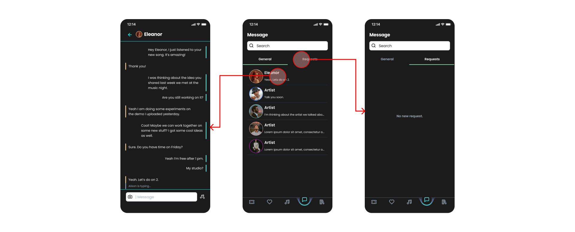
Improvement #3 Changing 3 to 5 Items on Navbar – Message to Connect
“If I can connect to people, where can I message the others?“
Feedback from user testing
More users asked for direct message function to connect and validate other artists’ interest. Regarding the previous improvement, we decided to move liked and message to navbar for a more concise layout content.
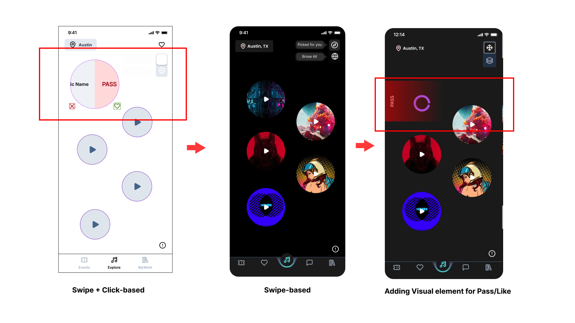
Improvement #4 Exploring Swipe-Based Interaction
- Click + Swipe
- Swipe only
- Visual presenting “pass and like” in the last prototype
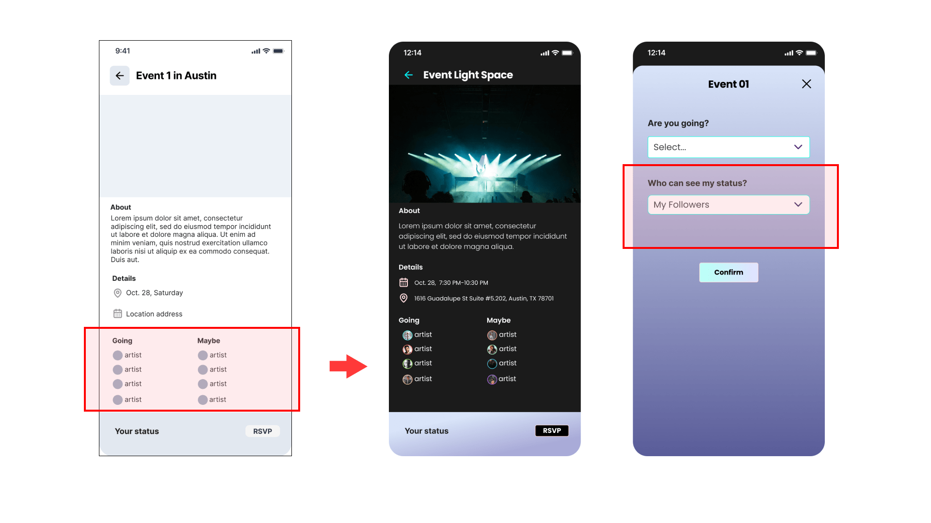
Improvement #5 Visible Going Status
“I like to see whether others are going. But I don’t want to show my status.“
Feedback from user testing
- Show/hide Your Status
- Only show artists you’ve followed
Improvement #6 Path to Share Music
“What does the trigger mean? I’m not sure how to share my music if I were an artist.“
“What does the add button mean?“
“I wanted to present my concept and ideas for my demo.”
Feedback from user testing
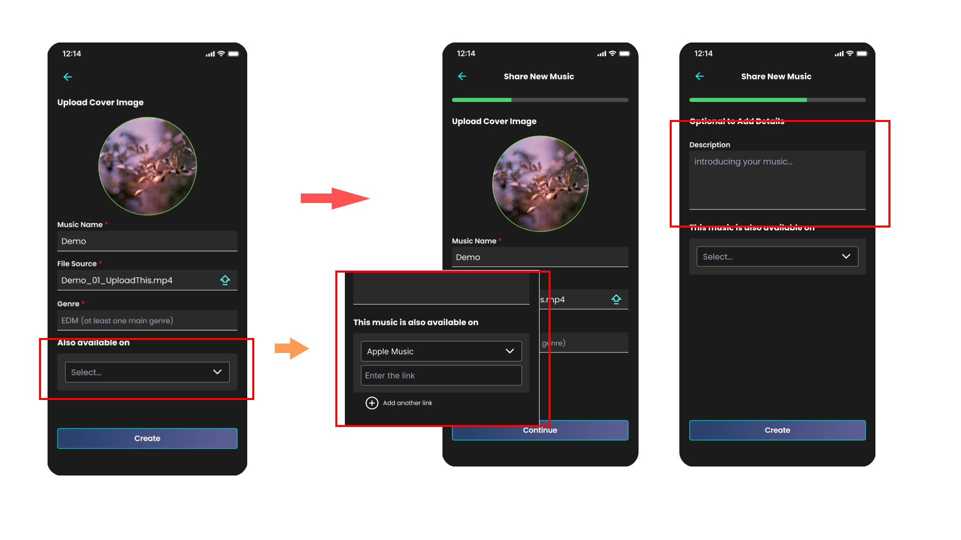
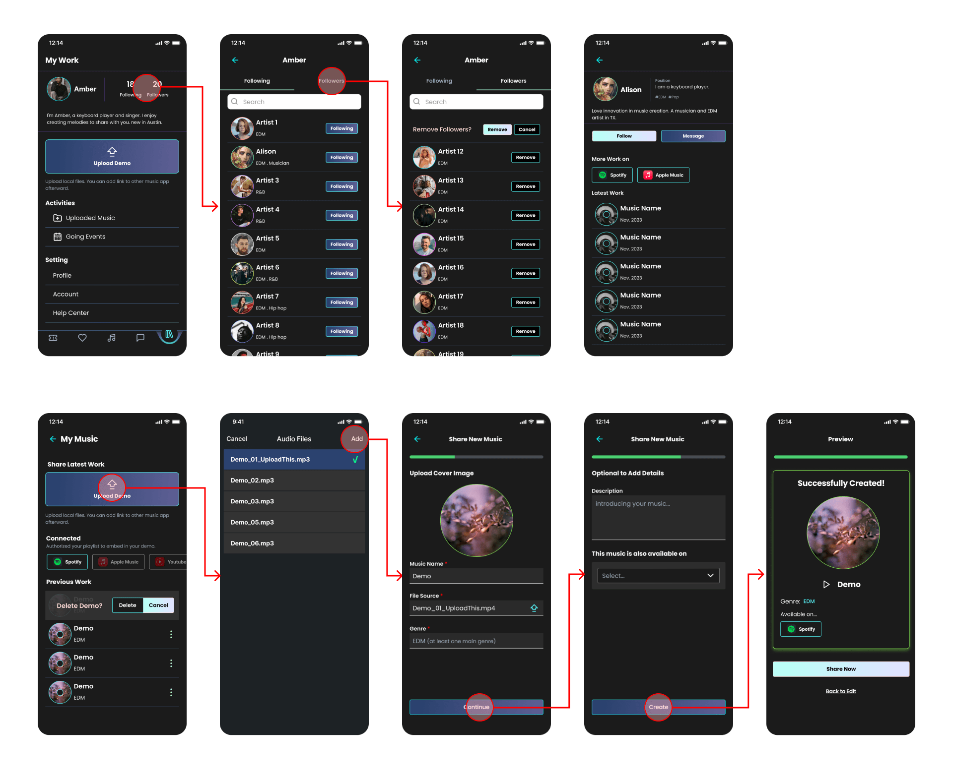
Designing path to share music was one of my biggest challenges in the project. In the beginning, I put triggers to indicate users can upload their music on other platform to prevent from multiple actions for all different platforms. However, the details remained unsolved. I, therefore, designed the uploading page with cover image, name, and file source.
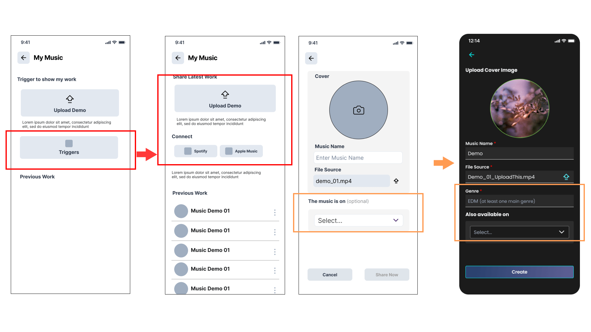
However, some labels didn’t not explain well and intuitive for users. Also, the feedback from users indicated the needs of conveying their music concept and genre selection. Therefore, the instruction got polished to “this music is also available on” and the button with “add another link” to clarify the meaning of each section. The progress bard was put on the top to offer for optional input when sharing music work but easy to use as well.
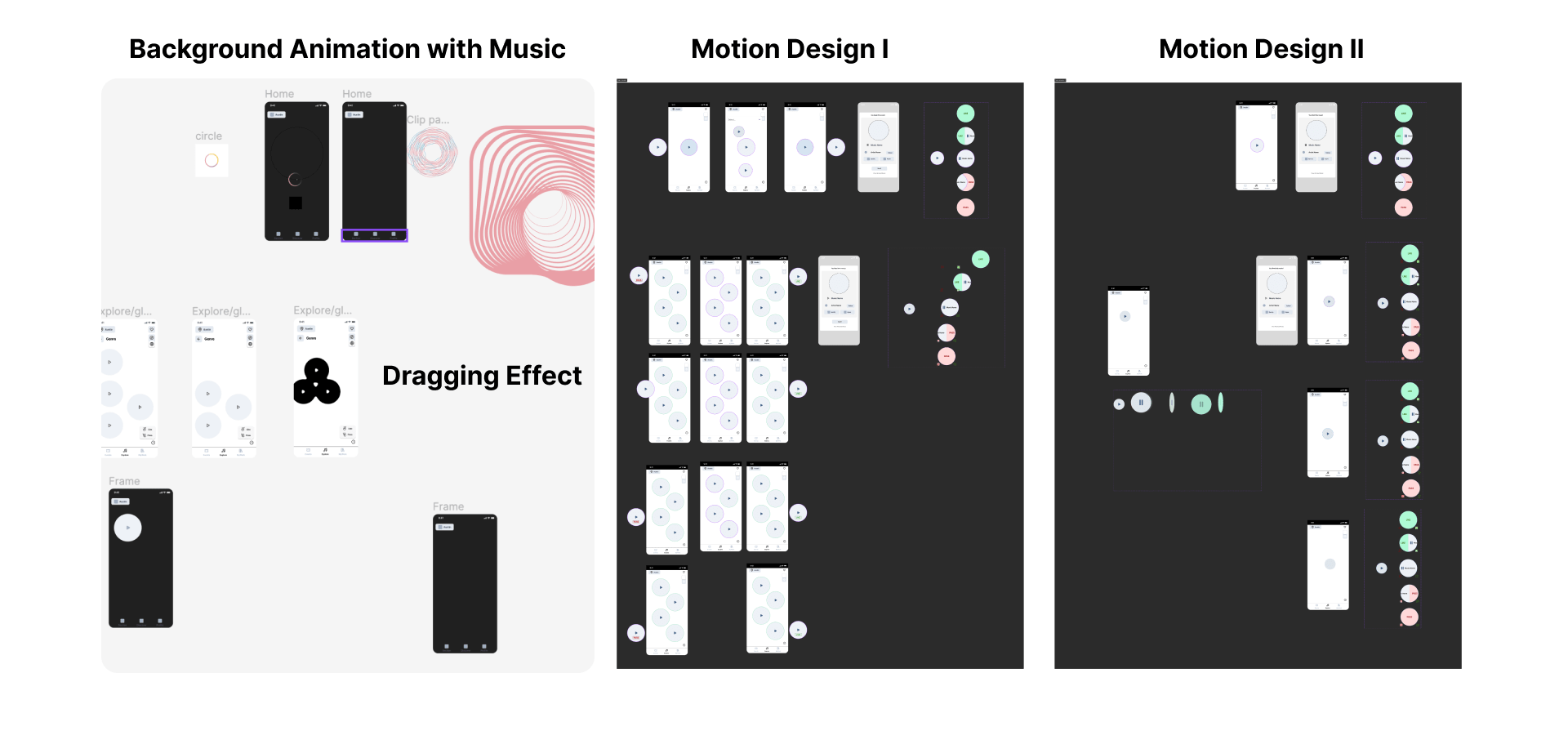
Motion Design Testing
During the prototyping, our team also created and tested each component with animation before being integrated into prototypes, accelerating our efficiency and making sure its feasibility.
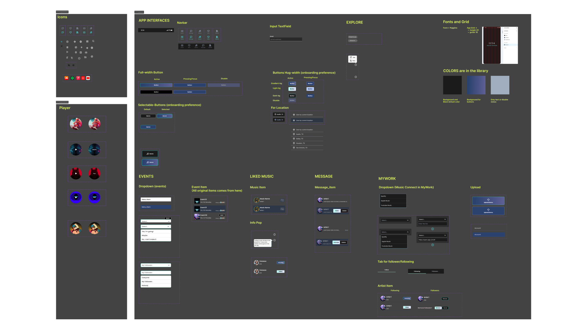
Design System
Built to collaborate with the team.
Final Work
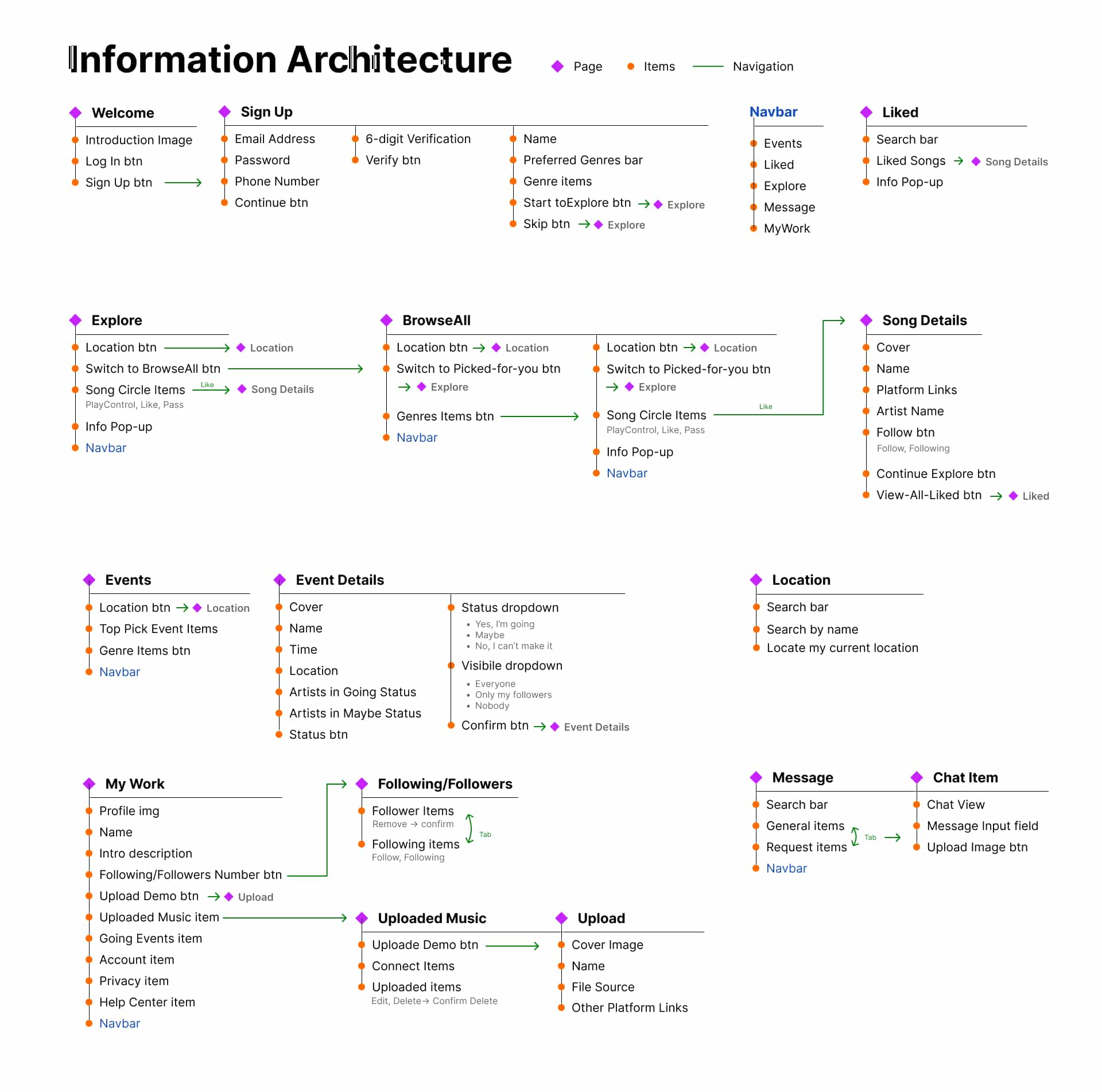
Information Architecture
Finally, we built out a full version of Information Architecture for our final prototype, allowing us to examine our functions and information hierarchy for future improvement.
Final Prototype
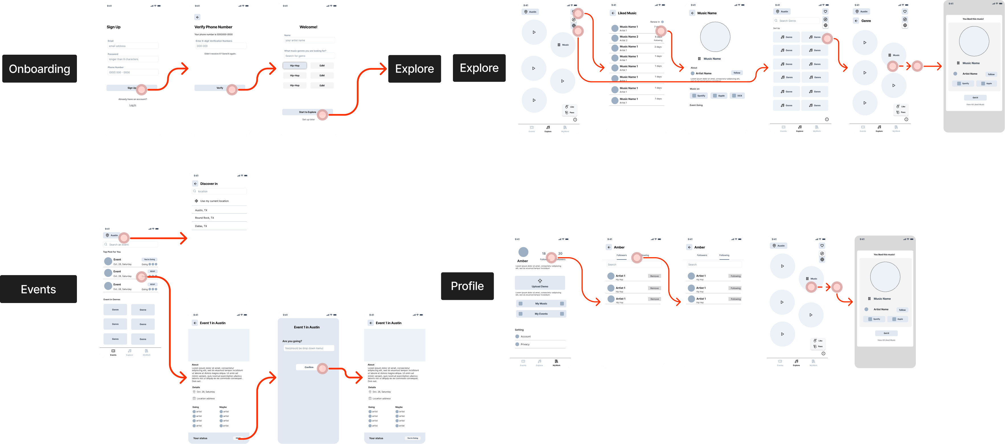
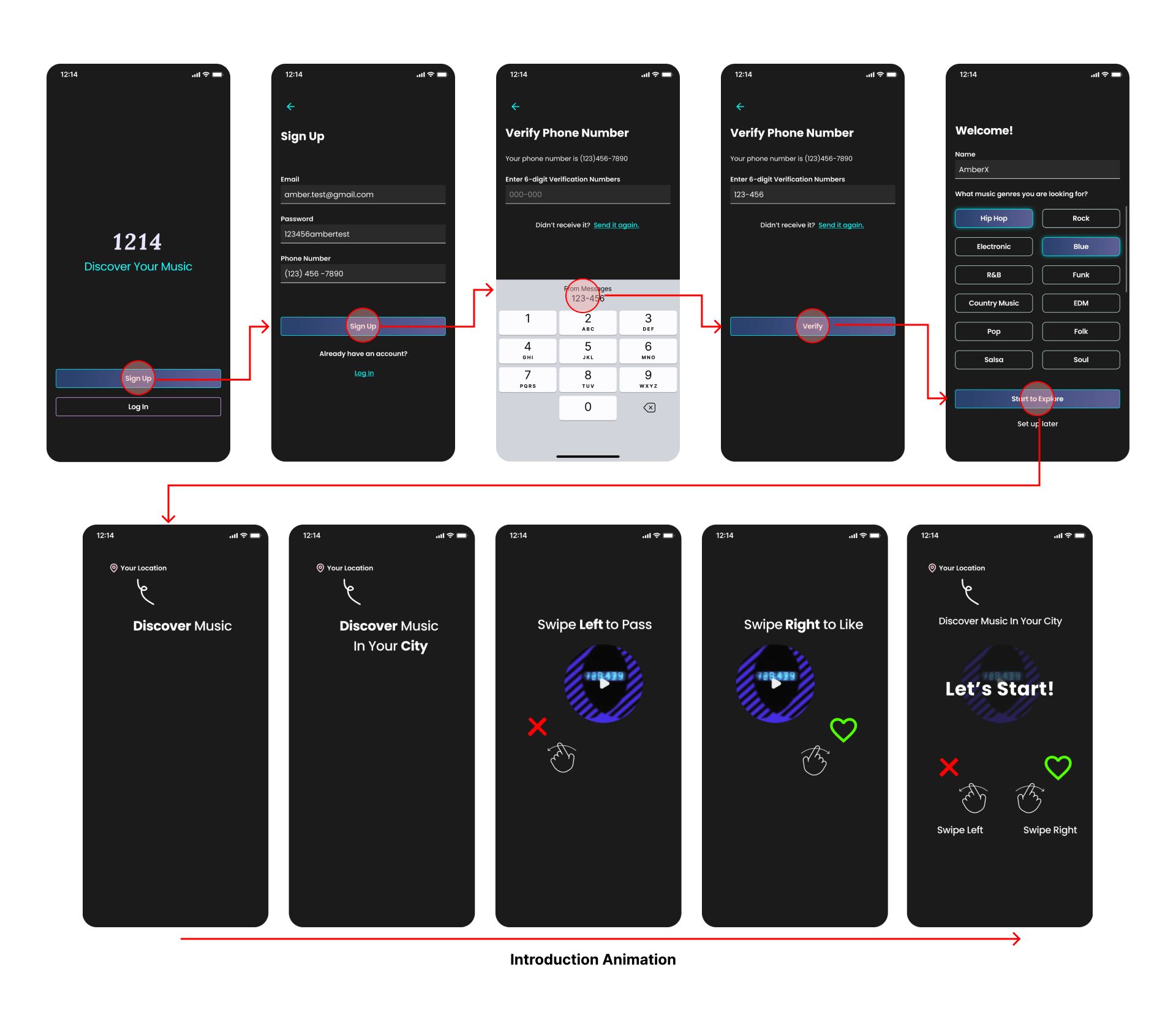
Onboarding Experience requires artists to validate phone numbers to ensure real identity. It gives artists an option to customize their preferences or set up later. Before landing on the main page, a short animation will pop up to guide artists how to use app for its location feature and swipe-based gesture.
Next, users will land on the Explore page. The Exploring page allows users to click to play and pause, swipe left to skip, and swipe right to like and review the detail. Within the detail, users can also follow or review the artist’s profile. Moreover, it gives users options to browse all genres by switching toggle on the right top corner.
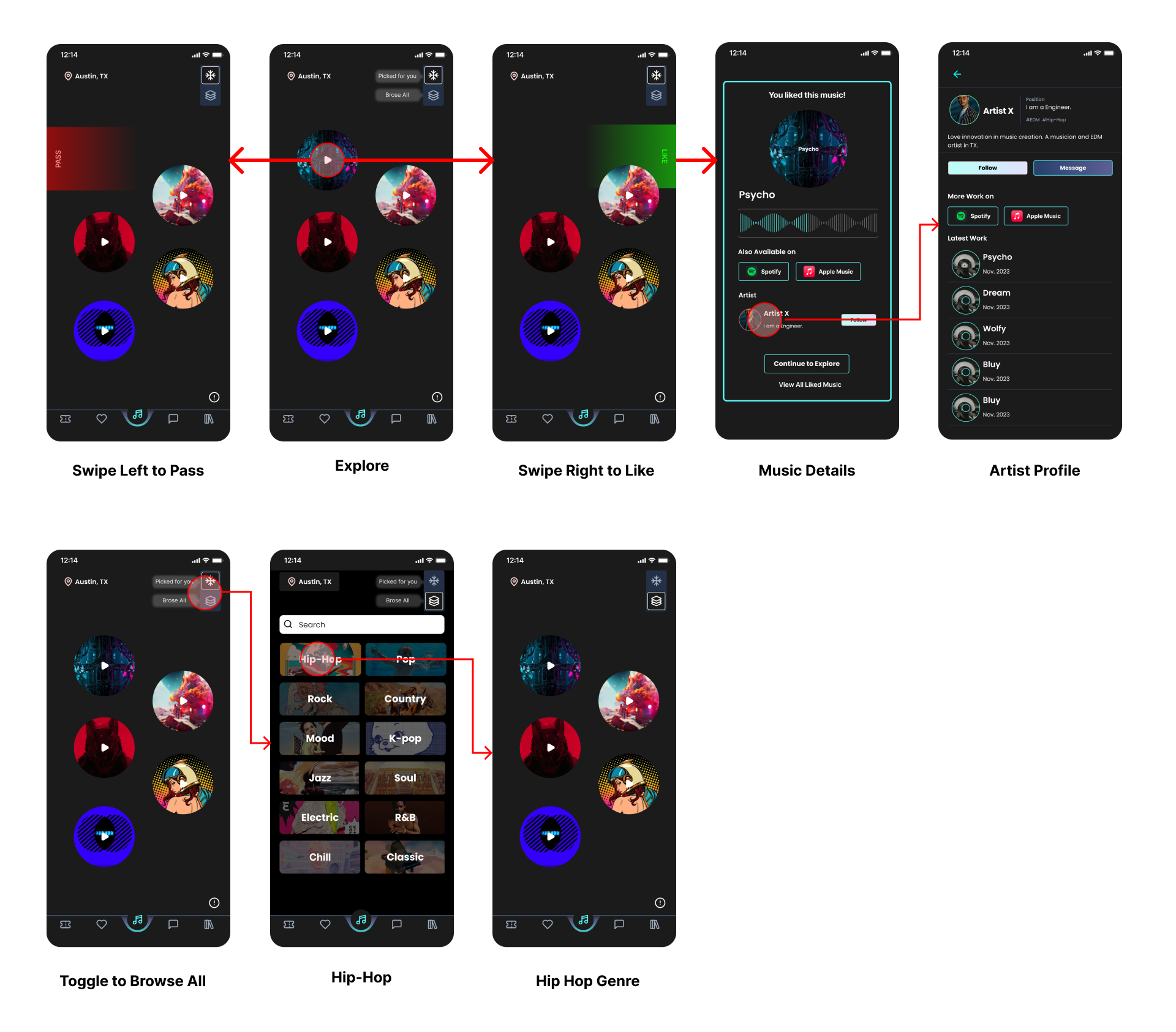
As the Liked page, users can review all their liked songs and review their details. In this prototype, each liked song can only stay in the playlist for seven days to encourage artists to discover and connect with people in the moment. If users really like a demo, they may click its external link to Spotify, for example, and follow that artist.
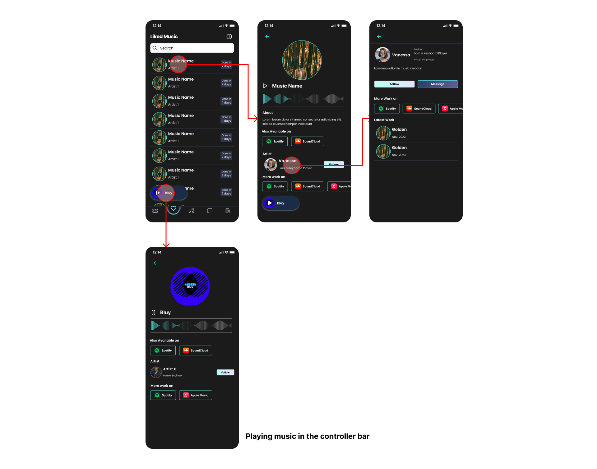
Moving to the Message page, users have general and requests sections. All chat history shows up in general. However, if someone who is not followed by the user sends a message, the message will go to the request to prevent spam and maintain healthy connection for artists.

Talking about the followers, all profile information and personal work are in the MyWork page. Users have options to review follower and followings. Users also can upload their demo in here as the second row of user flow as the following image.
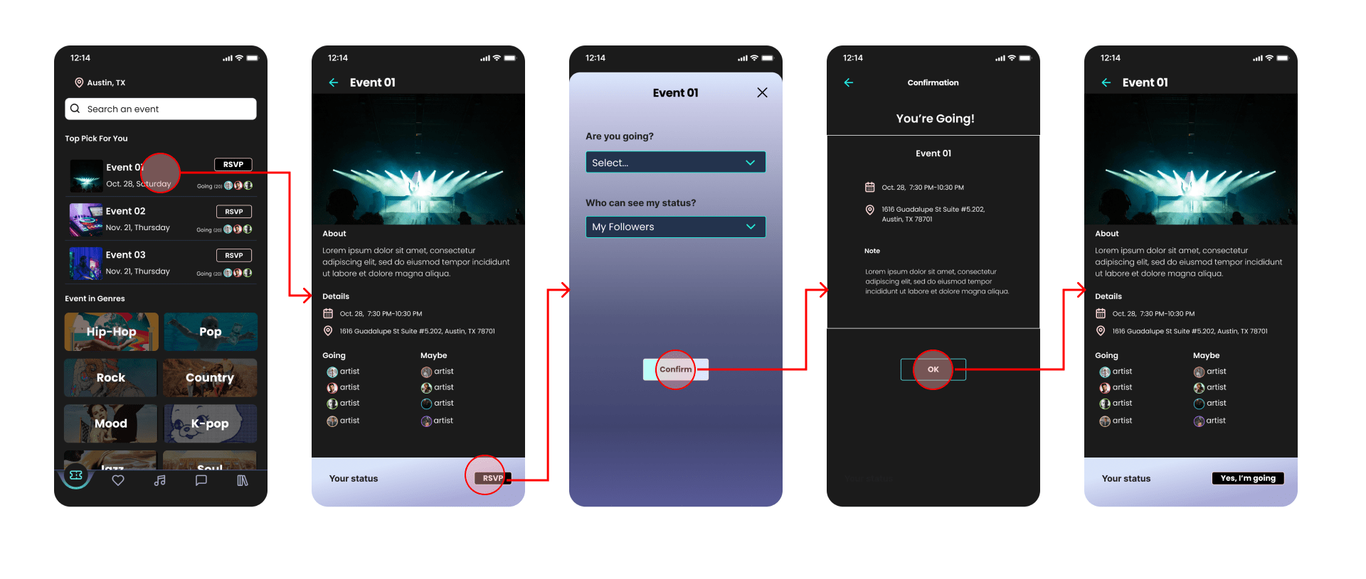
Lastly, one of the important feature is the Events page. The interesting feature learned from other app is to show users’ attendance. However, at the same time, they have options to choose who can see their status, everyone, followers, or nobody.
Conclusion
After nine weeks, we have successfully crafted the final prototype. Starting with the concept, we conducted generative research through user interviews and comparative analysis, transforming the findings into insights during brainstorming sessions using affinity diagrams. From wireframing solutions to designing prototypes, we refined our product through four rounds of prototyping and three rounds of user testing. We are confident in the quality of our final prototype.
However, there are a few areas where we could potentially enhance our design process:
Research Enhancement
- Pre-Interview Research: During the concepting phase, researching music genres before user interviews may provide deeper insights into the preferences from music artists.
- Diverse Brainstorming: When translating insights into design, exploring varied approaches in brainstorming sessions could expedite the development of swipe and click-based features, giving us ample time for early-stage A/B testing and more research approaches.
User Validation:
- Local Artist Feedback: Validating design solutions with local music artists is crucial for understanding regional variations in user journeys and behaviors.
Design Process Improvements:
- Scenario Exploration: Exploring multiple scenarios for specific features, like artist schedules and user journeys, enhances the overall thinking process.
If We Had More Time…
Despite three rounds of testing and 4 prototypes, there’s room for improvement in features and functionality. Given more time, we’d undertake the following:
Conduct A/B Testing for Swipe-based and Click-based Features
At the beginning of prototyping, we designed swipe-based and click-based features when exploring music work. We received positive feedback with the clickable and swipeable functions. However, once we solved the dragging interaction problem on Figma, our design returned to the initial wireframe for the swipe-based feature.
If we had more time, we would launch A/B testing for the swipe-based and click-based features to know which one may encourage engagement more through qualitative and quantitative analysis.
Test Prototypes with Local Music Artists
To delve deeper into user interaction, we wanted to validate our design solutions with local music artists. We would focus on two perspectives below:
Understanding the local artist ecosystems. Since artists are usually connecting in person, the location feature indicates that the user journeys may differentiate through regions and genres. It will need more research on behaviors and user journeys for future prototypes.
Testing features to validate its effectiveness. For example, in our current design, the liked music playlist will renew in seven days to provide instant discovery. However, it will need to validate the time range for washing off the playlists or design the algorithm to recommend music based on a user’s liked songs.
Ensure high-quality design delivery
If the project proceeds to actual development, focus on compatibility, scalability, and functional requirements to ensure a high-quality delivery, which is crucial for development and future cooperation.